Statistics and data
Reading tables, polls and charts, and spotting where percentages mislead.
 Statistics and data
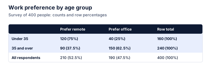
Row, column and total percentages in a data table
In a two-way table you can divide by the row total, the column total or the grand total. Each answers a different question. All three worked on one survey table.
 Statistics and data
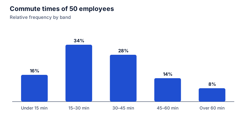
Relative frequency and cumulative percentages
Turn raw counts into a percentage distribution: relative frequency is each count ÷ the total, and cumulative percentage is the running total of those. A worked frequency table.
 Statistics and data
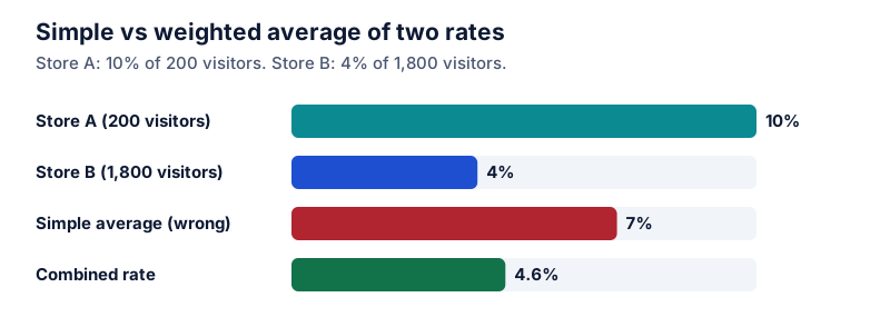
How to average percentages correctly
A simple average of percentages is only right when every group is the same size. How to weight by group size, with a worked example and the shortcut of going back to the counts.
 Statistics and data
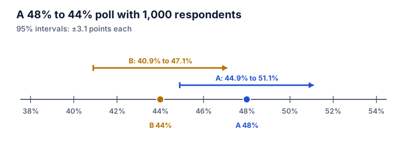
Reading poll percentages: what the margin of error means
What a poll's margin of error means, the standard formula for a proportion, values for common sample sizes, and why a lead between two candidates needs roughly double the margin.
 Statistics and data
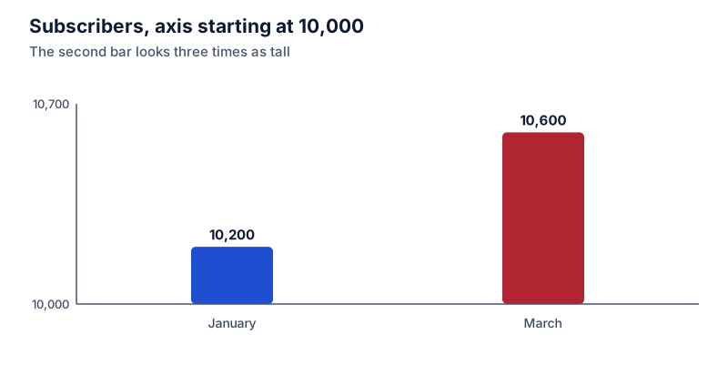
How charts make percentage changes look bigger than they are
A bar chart that starts its axis above zero can make a 3.9% rise look like a tripling. How truncated axes, cropped time ranges and mixed scales distort percentage changes, and how to check.
 Statistics and data
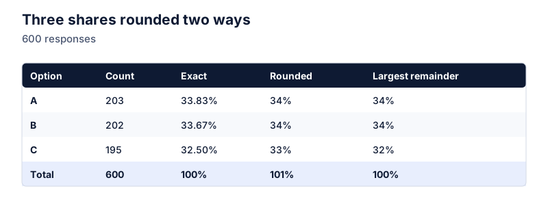
Why percentages don't always add up to 100
Rounded shares can total 99% or 101%, and multi-answer questions can total far more. Why it happens, when it signals an error, and how to round so the parts add up to exactly 100%.
 Statistics and data
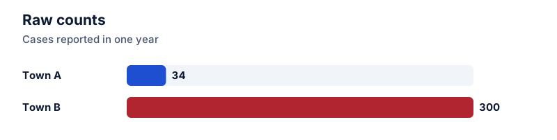
Comparing groups of different sizes: percentages and rates per 1,000
Raw counts mislead when groups differ in size. Convert to a percentage or a rate per 1,000 so a town of 8,500 and a city of 120,000 can be compared fairly. Worked examples and formulas.
 Statistics and data
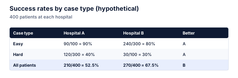
Simpson's paradox: when the overall percentage tells the opposite story
A treatment can win in every subgroup and still lose overall. A worked example of Simpson's paradox with two hospitals, why the combined percentage flips, and how to spot it in your own data.
 Statistics and data
Index numbers: setting a base of 100 to compare growth
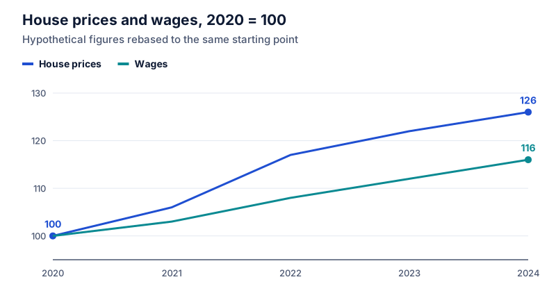
Rebase any series to 100 to compare growth on one scale. Index = value ÷ base value × 100. Worked example comparing house prices and wages, plus how to read index changes correctly.
 Statistics and data
Relative risk vs absolute risk in health headlines
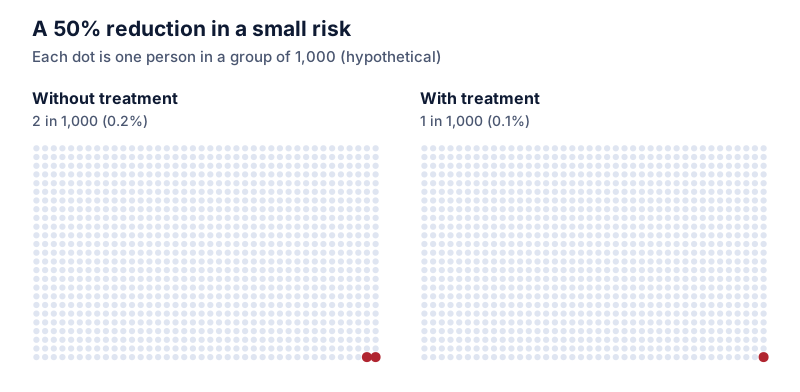
“Cuts your risk by 50%” can mean going from 2 in 1,000 to 1 in 1,000. How to convert relative risk to absolute risk, why percentage points matter, and what number needed to treat means.