How charts make percentage changes look bigger than they are
A bar chart that starts its axis above zero can make a 3.9% rise look like a tripling. How truncated axes, cropped time ranges and mixed scales distort percentage changes, and how to check.
Read the axis before the bars. If the vertical axis starts above zero, bar heights no longer show the size of the change. Work out the percentage from the numbers themselves: a rise from 10,200 to 10,600 is 3.92%, however tall the second bar looks.
On this page
Charts are often the first thing people look at, and sometimes the only thing. The same numbers can be drawn to look dramatic or dull. Knowing the common tricks lets you read the real size of a change in a few seconds.
The truncated axis
A newsletter grows from 10,200 subscribers in January to 10,600 in March. Draw it as a column chart whose vertical axis starts at 10,000:
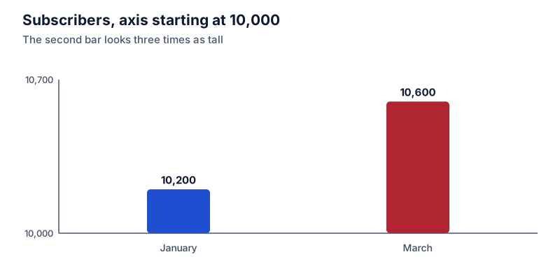
The January bar rises 200 units above the baseline and the March bar 600, so March looks three times as big. Now start the axis at zero:
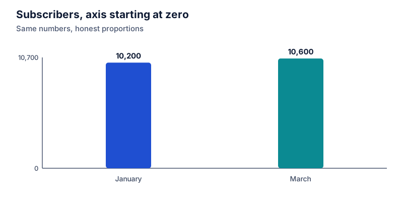
The two bars are nearly the same height, because the values are nearly the same. The actual change:
(10,600 − 10,200) ÷ 10,200 × 100 = 3.92%
Where 10,200 is the starting value
Try it: 10,200 → 10,600 subscribers
Open in calculatorBar and column charts encode values as lengths, so the baseline should be zero. When it isn’t, the visual ratio between bars is set by where the axis starts, not by the data.
Cropped time ranges
A line chart that starts at a low point makes any later value look like strong growth. One that starts at a peak makes the same period look like decline. If a chart shows “up 40%,” check when it starts and whether a longer range tells a different story. For changes over many periods, CAGR gives one comparable yearly figure.
Percentages without the base
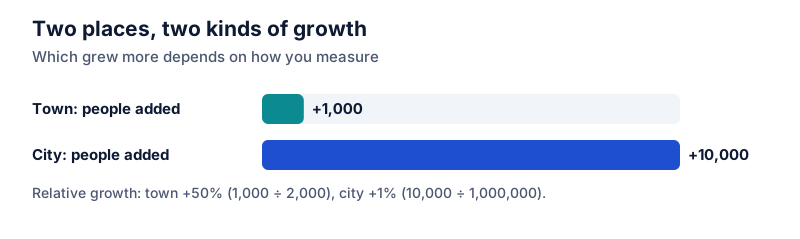
“Sales of the new model up 300%” might mean 2 units became 8. Percent changes on small bases swing wildly. Look for the underlying counts, or the absolute change next to the relative one.
Two axes on one chart
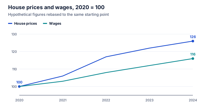
Dual-axis charts put two series with different scales on the same plot. By stretching one axis, the chart maker can make the lines cross, run in parallel, or diverge. To compare growth fairly, rebase both series to 100 at the same starting point. See index numbers.
Areas and 3D shapes
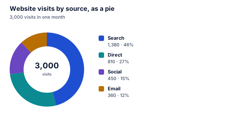
When an icon is scaled in both width and height to show a doubling, its area quadruples, and readers perceive it as four times larger. 3D pie charts distort slices near the front. Flat bars with a zero baseline avoid both problems.
A quick checklist
- Read the axis labels. Does the value axis start at zero?
- Take the two values being compared and compute the percentage change yourself.
- Check the start and end dates.
- Look for the base: how many units is the percentage of?
- If there are two axes, compare indexed values instead.
If you build charts yourself, the spreadsheet chart guide covers setting the axis and labels.
Questions
Is a chart with an axis that doesn't start at zero always misleading?
No. For line charts of values that never get near zero, such as body temperature or a stock index, a zoomed axis can be the clearer choice. The problem is mainly bar and column charts, where readers compare bar lengths, and any chart that doesn’t label its axis.
How do I quickly check a chart I see in the news?
Find the two values being compared, read them off the labels rather than the shapes, and calculate the percentage change yourself. Then check the time range and whether the axis is linear.
The calculator links in this guide are checked against the PercentSwift calculator every time the site is built. How we calculate explains the rounding rules. If you spot a mistake, email hello@percentswift.com.