Percentage charts in spreadsheets: pie, stacked bar or something else
Which chart to use for percentages in Excel or Google Sheets: pie or 100% stacked bar for parts of a whole, bar charts for comparing shares, line charts for rates over time. Setup steps and labeling tips.
For parts of one whole that add to 100%, use a pie (up to about five slices) or a 100% stacked bar. To compare a percentage across groups, use a bar chart with the axis starting at zero. For a rate over time, use a line chart. Label the values directly so readers don’t have to estimate angles.
On this page
Choosing the right chart for percentages depends on what the reader needs to compare. Here are the common cases and how to set them up in Excel or Google Sheets.
Parts of a whole
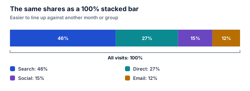
When the shares add to 100%, a pie or a 100% stacked bar shows how the whole divides up.
Search brought 1,380 of 3,000 visits:
Try it: 1,380 of 3,000 visits
Open in calculator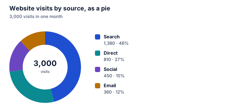
Pie charts work for a few slices with clearly different sizes. Past five or six slices, or with similar values, readers struggle to compare angles.
100% stacked bars are easier to compare. Put several months or groups as separate bars and the shifts stand out.
To make one: select the categories and values, then Insert > Chart and pick Pie, or Bar > 100% Stacked Bar. In Google Sheets, use Insert > Chart and choose the type in the chart editor.
Comparing a percentage across groups
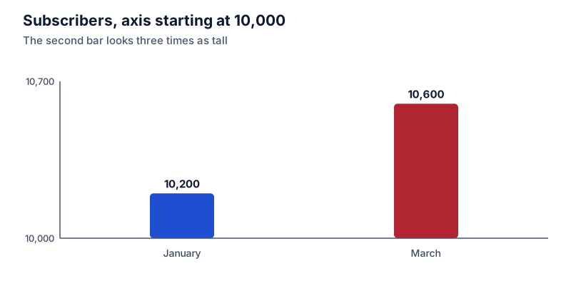
To compare, say, conversion rate by region, use a regular bar or column chart. Start the value axis at zero: bar length is what readers compare, and a truncated axis exaggerates differences. See misleading percentage charts.
Percentages over time
For a rate tracked over months, such as a monthly churn rate, use a line chart. A zoomed axis is acceptable on a line chart if you label it clearly, since readers follow the slope rather than comparing lengths.
Labeling
- Add data labels (Chart elements > Data labels, or Customize > Series > Data labels in Sheets).
- Show the values the way your source cells are formatted. If the cells are percent-formatted decimals, labels will show percentages.
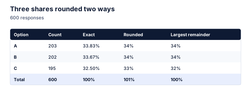
- In pies, “Category name” plus “Percentage” labels are often enough. Excel’s built-in pie percentage is calculated from the values, so it adds to 100% before rounding.
- Mention the total somewhere, in the title or a note: “3,000 visits.”
Things to avoid
- Pies for multiple-answer questions. If respondents could pick more than one answer, the percentages add to more than 100% and don’t form a whole. Use bars. See why percentages don’t add to 100.
- 3D effects. They distort slice and bar sizes.
- Dual axes for two percentages. Put both on one axis if they share a scale.
For the formulas behind the chart data, see percentages in Google Sheets and percentage of total in Excel.
Questions
Should I chart the counts or the percentages?
Chart percentages when the groups or periods have different totals, so the comparison is fair. Chart counts when the size itself matters. Showing both in the label, like 1,380 (46%), covers both needs.
Why does my pie chart have a tiny unreadable slice?
Small categories get thin slices. Combine them into an “Other” slice, or switch to a bar chart, where small values are still visible.
The calculator links in this guide are checked against the PercentSwift calculator every time the site is built. How we calculate explains the rounding rules. If you spot a mistake, email hello@percentswift.com.